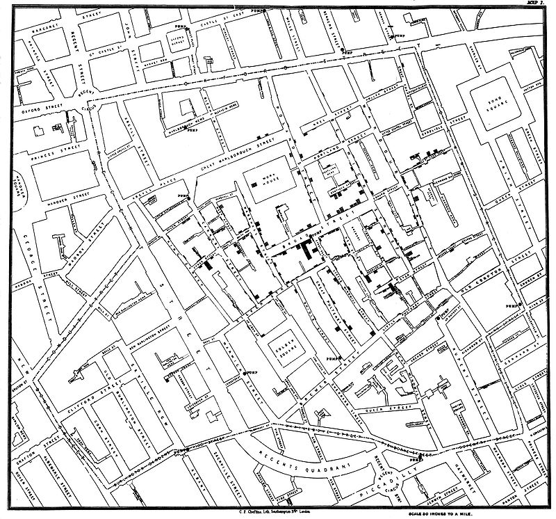
Let me tell you the story of a graph which changed the world.
Some people hate the very name of statistics, but I find them full of beauty and interest. Whenever they are not brutalised, but delicately handled by the higher methods, and are warily interpreted, their power of dealing with complicated phenomena is extraordinary.
-Sir Francis Galton
When we collect data, we are looking at a group of individuals.
The various attributes of these individuals are the variables.
Example: Who were the individuals in the case of the "John Snow" graph?
What variable John Snow was interested in?
Some variables numerically measure some characteristic of an individual, such as height, weight, exam scores, and so on. These are called quantitative variables.
Other variables simply put individuals into categories, such as sex, school subject, color, and so on. These are called categorical variables.
Visualizing Categorical Variables: Pie Charts and Bar Charts
Pie charts visualize the fraction or percentage individuals which fall into distinct categories.
Pie charts emphasize every category’s relation to the whole. A pie chart should include all the categories that make up a whole.
Bar charts show how percentages or counts vary across categories.
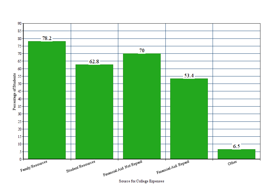
Example: How do students pay for college? The Higher Education Research Institute’s Freshman Survey includes over 200,000 first-time full-time freshmen who entered college in 2009. The survey reports the following data on the sources students use to pay for college expenses. $$ \begin{array}{lr} \hline \mbox{Source for College Expenses} & \mbox{Students} \\\hline\hline \mbox{Family resources} & 78.2\%\\\hline \mbox{Student resources} & 62.8\%\\\hline \mbox{Aid—not to be repaid} & 70.0\%\\\hline \mbox{Aid—to be repaid} & 53.4\%\\\hline \mbox{Other} & 6.5\%\\\hline \end{array} $$
Visualizing Quantitative Variables: Histograms.
A histogram tells us how frequently a numerical value occurs for a given quantitative variable.
The frequency is either a count of how many times the value was observed, or a percentage of the total observations.
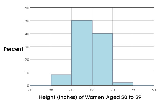
Example: The following data are the heights in inches of 100 women aged 20 to 29:
65.1 65.2 65.2 60.8 61.1 66.3 67.2 63.8 61.6 62.0 65.8 62.6 63.1 61.3 60.3 58.7 62.3 60.5 65.6 66.0 66.6 67.2 63.6 66.1 61.7 65.2 61.7 59.1 67.1 61.7 67.3 65.1 63.7 66.7 64.2 63.8 63.3 63.0 59.8 65.6 64.9 71.6 65.1 63.0 64.6 63.9 57.8 63.6 66.9 65.8 67.9 66.4 59.9 55.9 67.6 65.2 63.2 61.5 69.2 61.1 66.4 67.3 62.4 64.1 62.8 58.8 63.1 61.4 67.9 66.3 62.4 62.7 62.9 67.5 70.9 67.3 62.9 66.6 63.5 61.5 63.8 63.8 66.4 66.4 63.0 66.1 67.1 61.7 63.7 67.0 62.7 67.7 64.4 66.7 64.3 61.1 59.5 61.0 66.5 64.9
We can make a histogram with our Course Website.
Describing distributions of Quantitative Variables:
Every distribution has a shape, center, and spread.
A symmetric distribution is roughly a mirror image about its center.
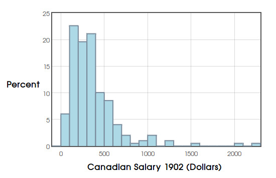
If a distribution has a long tail to the right, we say it's "skewed to the right."
If a distribution has a long tail to the left, we say it's "skewed to the left."
Observations which fall well outside of the overall pattern are called outliers.
Example: Consider height data we looked at earlier:
Example: The following data are the yearly salaries of Canadians in the year 1902:
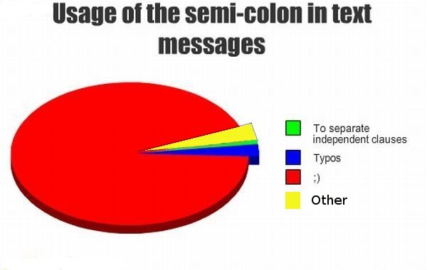
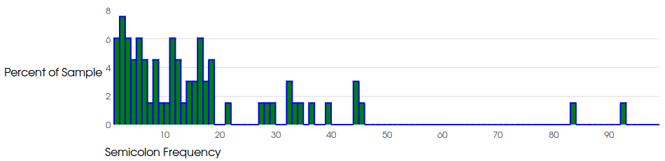
Example: The following is a histogram of semicolon frequency (measured as the number of semicolons per 100 sentences) in 70 Project Gutenberg e-texts.
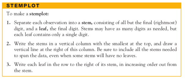
Visualizing Quantitative Variables: Stemplots.
Like a histogram, a stemplot tells us how frequently a numerical value occurs for a given quantitative variable.
A stemplot is a quick way to visualize data by hand.
We usually don't make stem plots for very large data sets.
Example: Make a stemplot for the following data which are the percentages of people aged 65 and older in 2009 for each state and the Distict of Columbia (Washington D.C.).
13.5 7.0 12.9 14.0 10.9 10.3 13.6 13.8 16.9 10.0 14.1 11.7 12.1 12.6 14.7 13.0 12.9 12.1 15.0 11.8 13.4 12.9 12.4 12.5 13.5 14.1 13.3 11.3 12.8 13.2 12.6 13.2 12.4 14.6 13.6 13.3 13.2 15.3 14.0 13.1 14.3 12.9 10.1 8.8 13.8 11.8 11.8 15.5 13.2 12.1 11.8
Arranging the data from smallest to largest to makes the process easier:
7 8.8 10.0 10.1 10.3 10.9 11.3 11.7 11.8 11.8 11.8 11.8 12.1 12.1 12.1 12.4 12.4 12.5 12.6 12.6 12.8 12.9 12.9 12.9 12.9 13.0 13.1 13.2 13.2 13.2 13.2 13.3 13.3 13.4 13.5 13.5 13.6 13.6 13.8 13.8 14.0 14.0 14.1 14.1 14.3 14.6 14.7 15.0 15.3 15.5 16.9