We've seen several visual summaries of data: stem-and-leaf plots, line graphs, bar charts, histograms, frequency polygons.
Today we add another to that list: box plots.
The Five Number Summary
The five number summary of a data consists of the following values:
the minimum value, $Q_1$, the median, $Q_3$, and the maximum value.
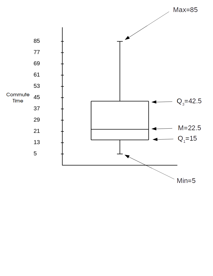
Example. Below are the commute times in minutes of $20$ randomly chosen New York workers in ascending order.
$5,\, 10,\, 10,\, 15,\, 15\, | \,15,\, 15,\, 20,\, 20,\, 20\, | \, 25, \, 30,\, 30,\, 40,\, 40\, |\, 45,\, 60,\, 60,\, 65,\, 85$
The five number summary is $$5,\, 15,\, 22.5,\, 42.5,\, 85.$$ Remark: Notice that the outlier we spotted last time stands out here. This is one nice advantage of the five number summary.
Box Plots: Box plots are a visualization of the five number summary.
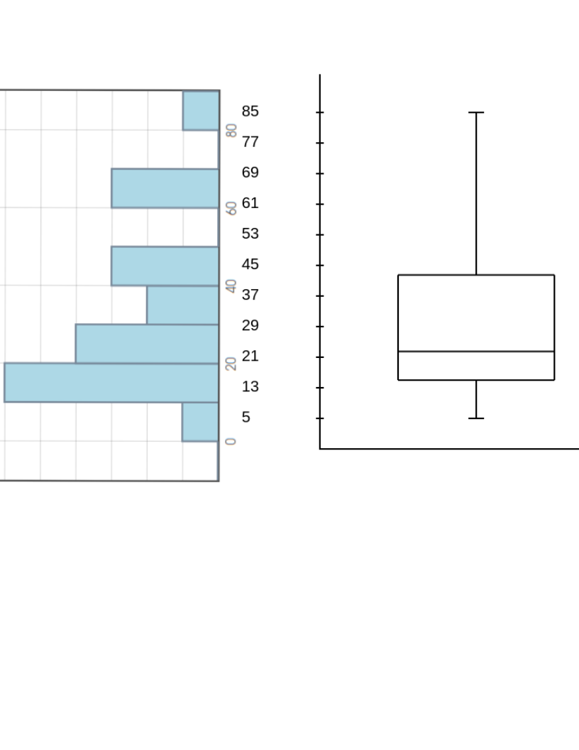
Comparing the box plot of the New York Travel Time data to its histogram...
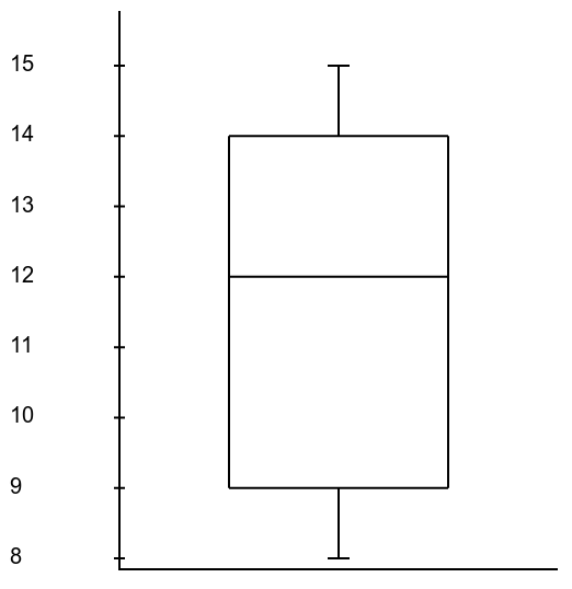
Example: Consider the box plot below.
|
Question: What is the $IQR$?
Question: Which interval contains the most data: from $9$ to $11,$ or from $14$ to $15?$ |
 |
Making a Box Plot: Listed below are a random sample of commute times to work of $20$ for workers in Martiniville, U.S.A. in order from smallest to largest.
$5, 8, 11, 13, 15, 16, 17, 17, 19, 19, 30, 31, 33, 35, 43, 44, 60, 61, 62, 82$
Construct a box plot either by hand,
by using your TI-84 Calculator,
or by using Holt.Blue.
Comparing Distributions: Box plots are a really nice way to compare multiple distributions.
One More Example: In a double blind study, a sample of $50$ people with a high BMI were recruited to participate in clinical trials for a new weight-loss drug. $25$ people were randomly selected to receive the medication, and the other $25$ were assigned to the placebo group. After two years, the the weight losses in kilograms for both groups were as follows:
$ \begin{array}{c} \begin{array}{cccccc} &&\mbox{Medication}&&&\\\ \end{array}\\\hline \begin{array}{cccccc} 35.6 & 81.4 & 57.6 & 32.8 & 31.0 & 37.6 \\ 36.5 & -5.4 & 27.9 & 49.0 & 64.8 & 39.0 \\ 43.0 & 33.9 & 29.7 & 20.2 & 15.2 & 41.7 \\ 53.4 & 13.4 & 24.8 & 19.4 & 32.3 & 22.0 \\ \end{array} \end{array} $ $\,\,\,\,\,\,\,\,\,\, \begin{array}{c} \begin{array}{cccccc} &&\mbox{Placebo}&&&\\\ \end{array}\\\hline \begin{array}{cccccc} 6.0 & -17.0 & 2.0 & -3.0 & 1.4 & 4.0 \\ 20.6 & 11.6 & 15.5 & -4.6 & 15.8 & 34.6 \\ 6.0 & -3.1 & -4.3 & -16.7 & -1.8 & -12.8\\ \end{array} \end{array} $
(a) How do we interpret the negative values?
(b) Use a side-by-side boxplot to compare the weight loss distribution of the medication group and the placebo group.
(c) What preliminary conclusion are you inclined to draw?
Special Note: Frequency polygons are another nice way to compare distributions.
| Percent | |
| Weight Loss |