But Seriously... A Question
Is there a relationship between manatee deaths caused by boats and boat registrations in Florida?
The Data
The table below lists the number of Florida boat registrations (in thousands) and manatee deaths from $1977$ to $2009.$ $$ \begin{array}{ccc} \hline \mbox{Year} & \mbox{Boat Registrations} & \mbox{Manatee Deaths}\\\hline 1977 & 447 & 13\\ \hline 1978 & 460 & 21\\ \hline 1979 & 481 & 24\\ \hline 1980 & 498 & 16\\ \hline 1981 & 513 & 24\\ \hline 1982 & 512 & 20\\ \hline 1983 & 526 & 15\\ \hline 1984 & 559 & 34\\ \hline 1985 & 585 & 33\\ \hline 1986 & 614 & 33\\ \hline 1987 & 645 & 39\\ \hline 1988 & 675 & 43\\ \hline 1989 & 711 & 50\\ \hline 1990 & 719 & 47\\ \hline 1991 & 681 & 53\\ \hline 1992 & 679 & 38\\ \hline 1993 & 678 & 35\\ \hline 1994 & 696 & 49\\ \hline 1995 & 713 & 42\\ \hline 1996 & 732 & 60\\ \hline 1997 & 755 & 54\\ \hline 1998 & 809 & 66\\ \hline 1999 & 830 & 82\\ \hline 2000 & 880 & 78\\ \hline 2001 & 944 & 81\\ \hline 2002 & 962 & 95\\ \hline 2003 & 978 & 73\\ \hline 2004 & 983 & 69\\ \hline 2005 & 1010 & 79\\ \hline 2006 & 1024 & 92\\ \hline 2007 & 1027 & 73\\ \hline 2008 & 1010 & 90\\ \hline 2009 & 982 & 97\\ \hline \end{array} $$
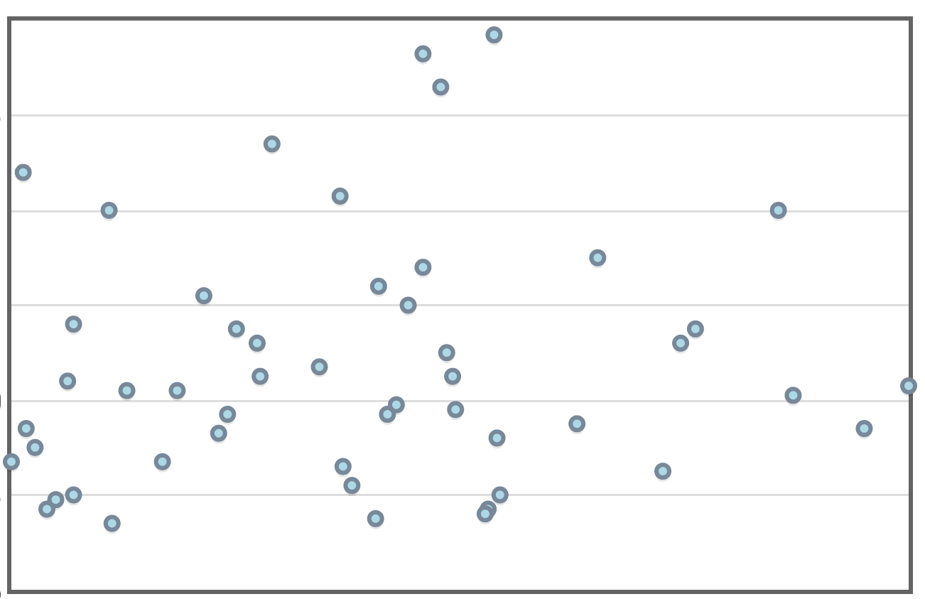
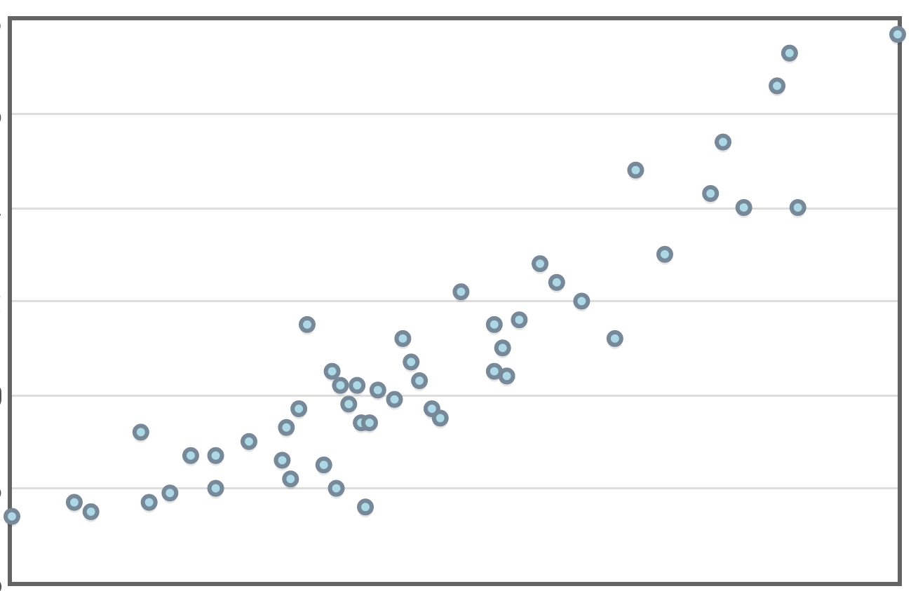
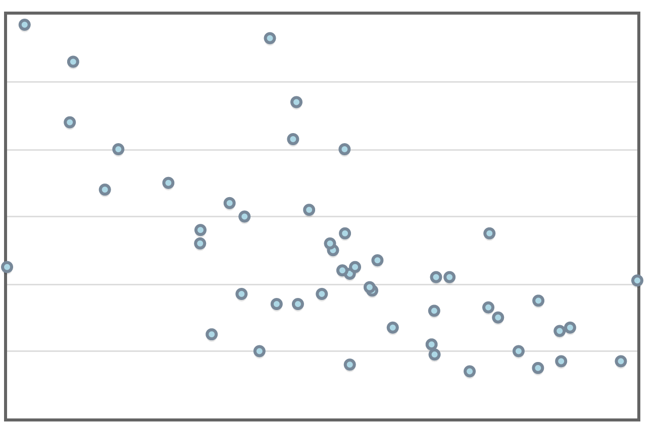
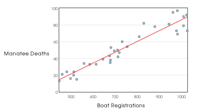
Example: Below is a scatterplot of manatee deaths versus the number of boat registrations (in thousands) in Florida.
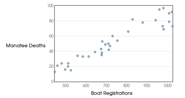
Each $(x,y)$ pair has the form $(\mbox{Boat Registrations},\mbox{Manatee Deaths}),$ and each point represents a particular year.
For example, in $1996,$ there were $\mbox{732,000}$ boat registrations, and in that year, $60$ manatees were killed by boats. This fact is represented by the ordered pair $(732,60).$
Vocab
In general, when graphing a relationship between two variables, the variable on the horizontal (or $x$) axis is called the explanatory variable, and the variable on the vertical (or $y$) axis is called the response variable.
The horizontal variable is also called the independent variable and the vertical variable is called the dependent variable.
Looking at the scatterplot, do you think manatee deaths in a given year are explained by the number of boat registrations?
Which is the explanatory variable? Which is the response variable?
When we compare the relationship between two quantitative variables, that is, make a scatterplot, we should make note of the following:
- Direction
- Overall Pattern
- Strength of the Relationship
- Outliers or Other Deviations from the Overall Pattern.
What do we see when we examine the manatee graph? What is the strength of the relationship?
Correlation is a way of measuring the strength and direction of a linear relationship.
Correlation is usually denoted by $r$. If the correlation, $r,$ is positive, the association is positive.
 |
 |
 |
 |
 |
 |
 |
| $r=0.112$ | $r=0.647$ | $r=0.746$ | $r=0.856$ | $r=0.915$ | $r=0.998$ | $r=1.000$ |
If the correlation, $r,$ is negative, the association is negative.
 |
 |
 |
 |
 |
| $r=-0.016$ | $r=-0.649$ | $r=-0.760$ | $r=-0.810$ | $r=-0.989$ |
The closer the correlation $r$ is to zero, the weaker the relationship.
Calculating Correlation
$$r=\frac{1}{n-1}\left[ \left(\frac{x_1-\overline{x}}{s_x}\right) \left(\frac{y_1-\overline{y}}{s_y}\right)+\left(\frac{x_2-\overline{x}}{s_x}\right) \left(\frac{y_2-\overline{y}}{s_y}\right) +\cdots+\left(\frac{x_n-\overline{x}}{s_x}\right) \left(\frac{y_n-\overline{y}}{s_y}\right) \right]$$ The more compact notation uses sigma notation: $$r=\frac{1}{n-1}\sum_{j=1}^{n}\left(\frac{x_j-\overline{x}}{s_x}\right) \left(\frac{y_j-\overline{y}}{s_y}\right)$$
Example: Suppose we collect the data set: $(1,1)$,$(2,4)$, and $(3,4)$. What is the correlation?
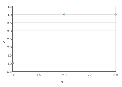
For the above data set, $x_1=1,$ $x_2=2,$ and $x_3=3.$ so, $\bar{x}=2$ and $s_x=1.$
Also, $y_1=1,$ $y_2=4,$ and $y_3=4.$ so, $\bar{y}=3$ and $s_y=1.7321.$
We then have $$ \begin{array}{rl} r&=\displaystyle \frac{1}{3-1}\sum_{j=1}^{3}\left(\frac{x_j-\overline{x}}{s_x}\right) \left(\frac{y_j-\overline{y}}{s_y}\right)\\ &=\displaystyle \frac{1}{3-1}\left[ \left(\frac{x_1-\overline{x}}{s_x}\right) \left(\frac{y_1-\overline{y}}{s_y}\right)+\left(\frac{x_2-\overline{x}}{s_x}\right) \left(\frac{y_2-\overline{y}}{s_y}\right)+\left(\frac{x_3-\overline{x}}{s_x}\right) \left(\frac{y_3-\overline{y}}{s_y}\right) \right]\\ &=\displaystyle \frac{1}{2}\left[ \left(\frac{1-2}{1}\right) \left(\frac{1-3}{1.7321}\right)+\left(\frac{2-2}{1}\right) \left(\frac{4-3}{1.7321}\right)+\left(\frac{3-2}{1}\right) \left(\frac{4-3}{1.7321}\right) \right]\\ &=\displaystyle \frac{1}{2}\left[ \left(-1\right) \left(-\frac{2}{1.7321}\right)+\left(0\right) \left(\frac{1}{1.7321}\right)+\left(1\right) \left(\frac{1}{1.7321}\right) \right]\\ &=\displaystyle \frac{1}{2}\left[ \frac{3}{1.7321}\right]\\ &=\displaystyle \frac{3}{2\cdot 1.7321}\\ &=\displaystyle 0.866\\ \end{array} $$
Example
The manatee data has a correlation of $r=0.951.$ This indicates a fairly strong linear relationship between boat registrations and manatee deaths.
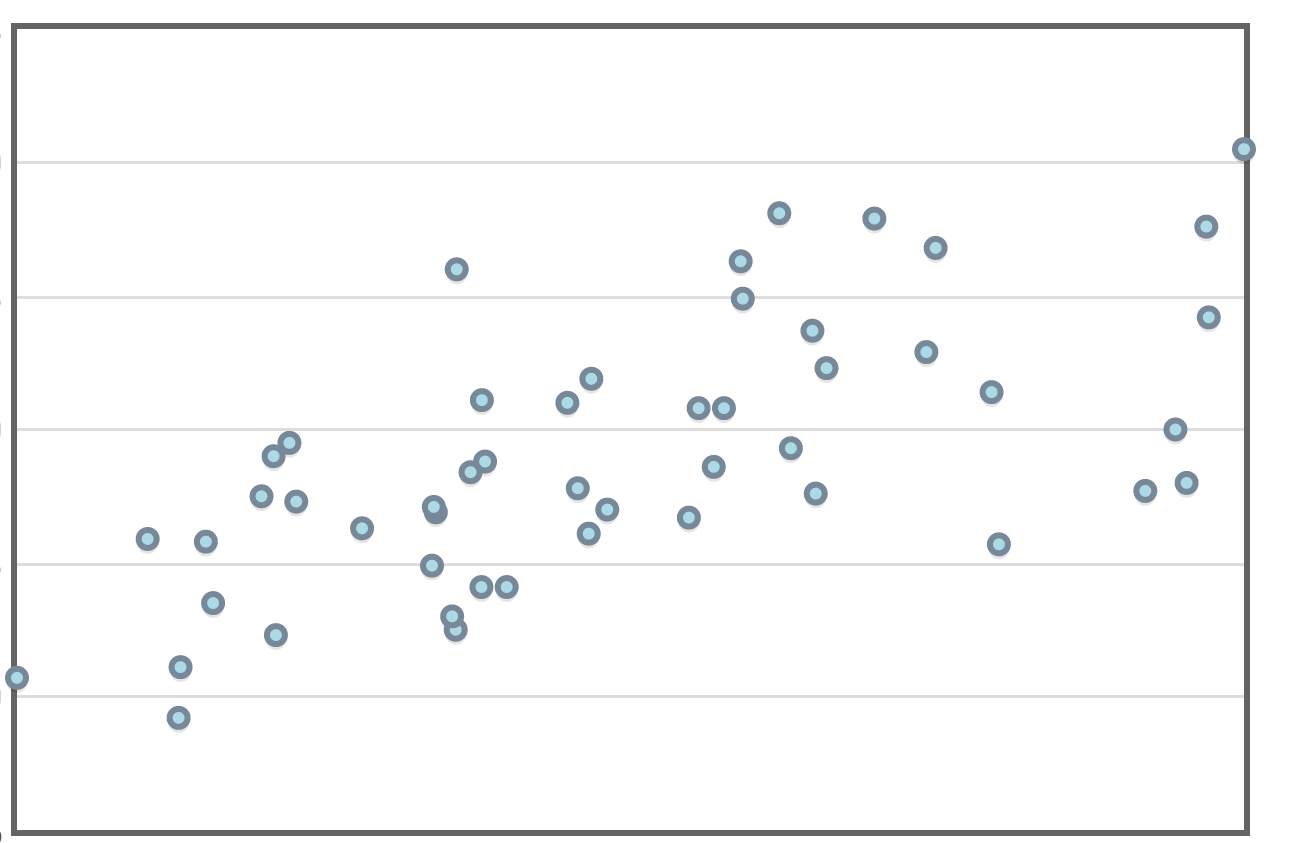
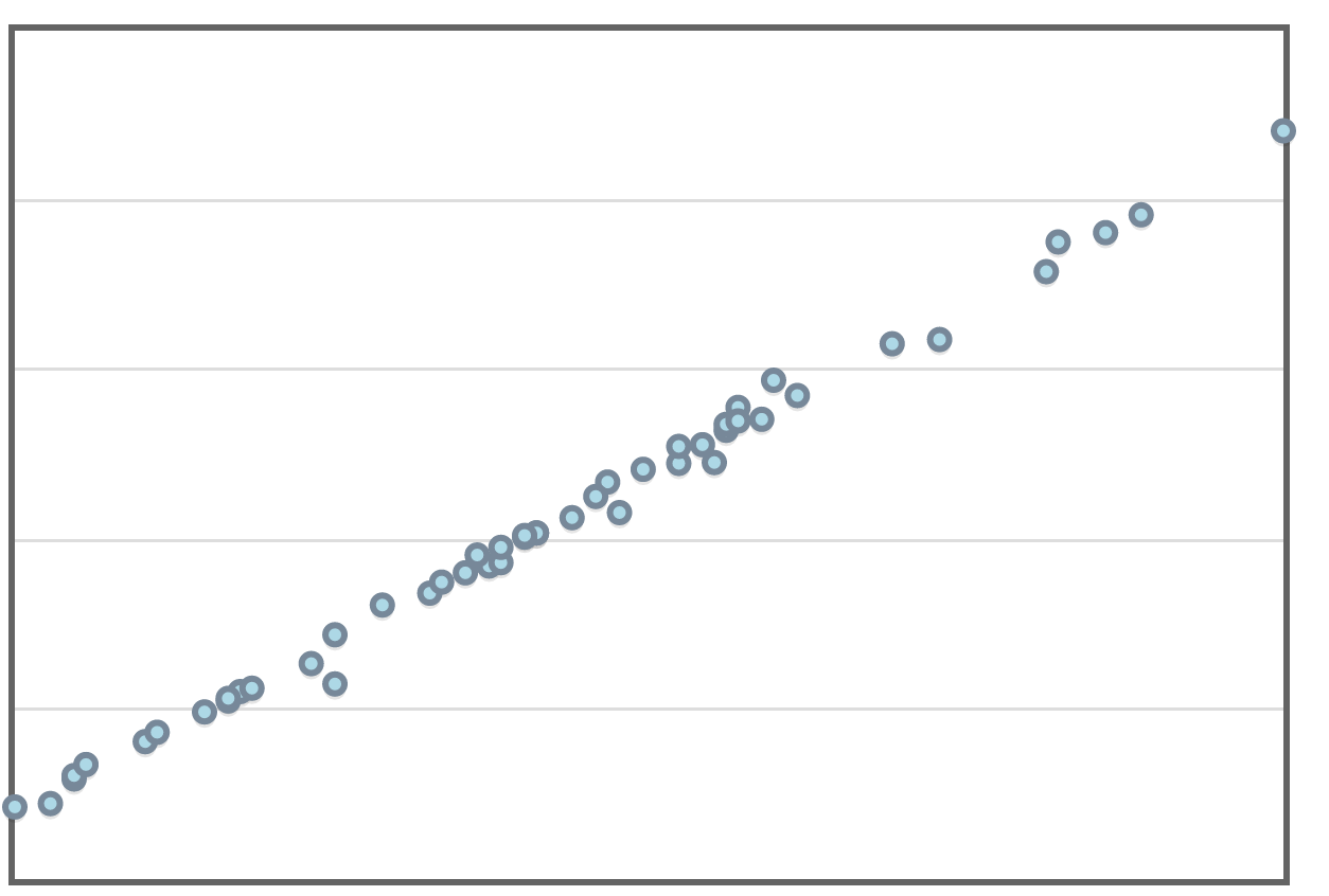
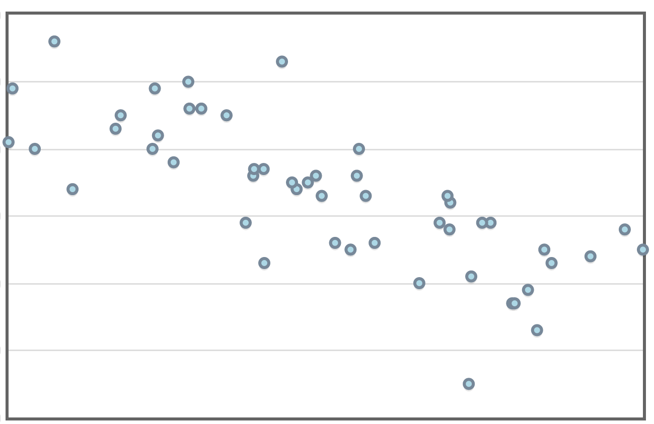
Example: We are now going to model the manatee data with a straight line.
Below is the manatee death versus boat registration data with a line which models the overall trend.
This line-of-best-fit is called a least-squares regression line.
Some Straight-Line Basics
Recall that every non-vertical straight line can be expressed in the form $y=mx+b$.
Statisticians, as well as our textbook, prefer to write a generic line as $y=a+bx.$
The Regression Line
When the trend appears to be linear, we model our data with a regression line, or line of best fit, which has the form $$\hat{y}=a+bx$$ where $a$ and $b$ are computed with the formulas given below.
The notation $\hat{y}$ is a reminder that our line gives us a prediction, or an approximate guess based upon the data.
We can calculate the slope and $y$-intercept of our line of best fit.
The slope is $\displaystyle b=r\frac{s_y}{s_x}.$
The $y$-intercept is $a=\bar{y}-b\bar{x}.$
A Quick Example
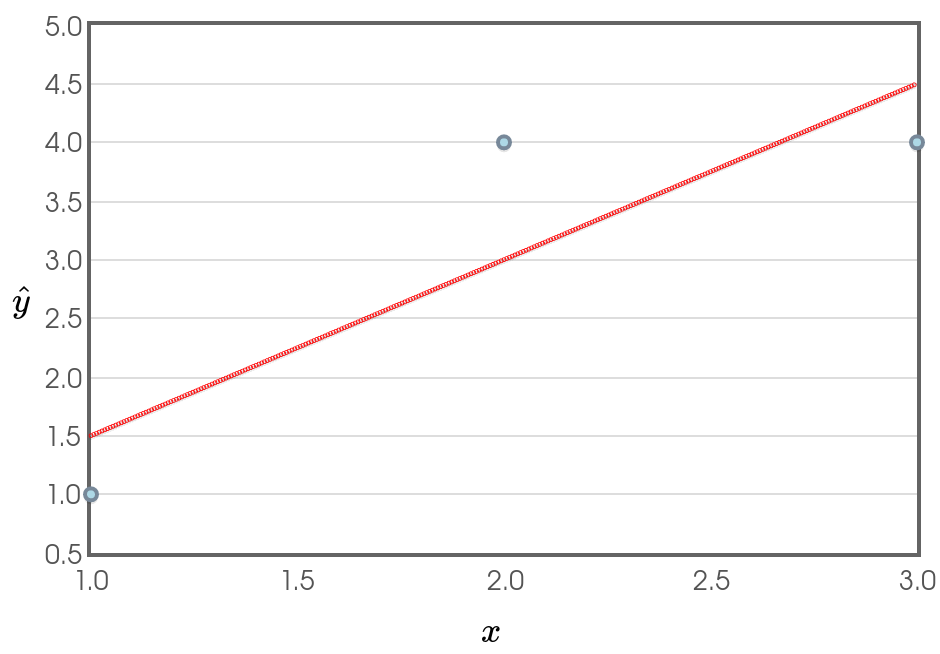
Thus, for the line above, $\hat{y}=a+bx,$ we have $b=\displaystyle r \frac{s_y}{s_x}=0.866\cdot\frac{1.7321}{1}=1.5$ and $a=\bar{y}-b\bar{x}=3-1.5\cdot 2=0.$
Our line of best fit is $\hat{y}=0+1.5x=1.5x.$
Returning to our Manatee Data
Using software, the regression line for the manatee data is $\hat{y}=0.129x-43.172$.
Why This is So Useful: If we know in advance the number of boat registrations for the year, we can roughly predict how many manatee deaths will occur in that year.
Example: Using the regression line for the manatee data, predict the number of manatee deaths that will occur in a year with $\color{magenta}{850}$ boat registrations.
In this case $\hat{y}=0.129\cdot \color{magenta}{850}-43.172=66.418$.
Interpretation: We predict that approximately $66$ manatees will die in a year in which there are $850$ boat registrations.
Another Interpretation: In years where there are $850$ boat registrations, the approximate average number of manatee deaths is $66.418.$
From Correlation to R-Squared
Recall that the correlation $r$ is a way of measuring the strength and direction of a linear relationship.
When we square this value, we get a more useful measure for our regression line.
$r^2$ is interpreted as the percentage of the variation in the data which can be explained by our model is actually given by the value of $r^2$.
The manatee data has a correlation of $r=0.951$.
For our regression line model, $r^2=0.951^2=0.905$, or $90.5\%,$ of the variation in manatee deaths is explained, or accounted for, by the number of boat registrations.
|
|
|
|
|
|
|
| $r^2=0.013$ | $r^2=0.419$ | $r^2=0.557$ | $r^2=0.733$ | $r^2=0.837$ | $r^2=0.996$ | $r^2=1.000$ |
|
|
|
|
|
| $r^2=0.000$ | $r^2=0.421$ | $r^2=0.578$ | $r^2=0.656$ | $r^2=0.978$ |
Good Statistical Practice
When you present your reader with a regression line model, it is good practice to report the value of $r^2$.
Residuals
A residual is the difference between a data point $y$ and the predicted value $\hat{y}$ for a given $x$.
Each residual is calculated as $\color{darkpink}{y-\hat{y}}$ for any given value of $x$.
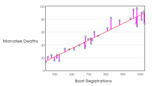
Residual Plots
A residual plot is the residuals on the vertical axis, and the explanatory variable on the horizontal axis.
The residual plot tells us a lot about how well our line fits the data.

Residual Plots
A residual plot leaves off the vertical lines.
Residuals
For any good fit, the residuals should have three very specific characteristics:
- A residual plot should look like a random "cloud of dots" with no pattern.
- The residuals should not consistently increase or decrease as explanatory variable increases.
- The distribution of the residuals should be roughly symmetrical around $0$ with no obvious skew and no outliers.
Stop Taking Notes Now!
We are now going to talk informally about some things we should consider when we do a linear regression.
Consideration #1: Limitations of Linear Regression
Be aware that linear regression is not appropriate for all types of data.
That said, linear regression can be used for a lot of situations.
In practice, linear regression is the most common form of regression analysis.
Good News: The homework only deals with linear regression.
We're now going to consider a data set where the assumption of linearity is questionable...
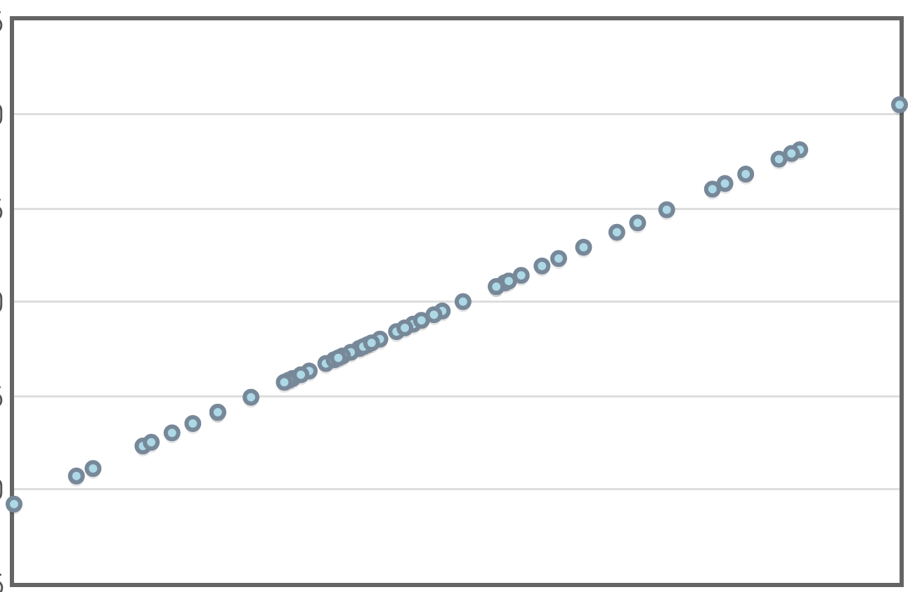
Example
Consider the following data set plotting the census data of a small, rural town against time.
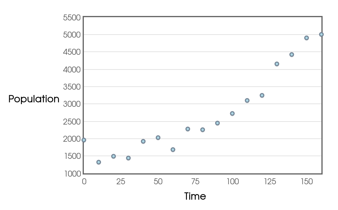
It looks like a line might be a good fill so we try it...
Example
Here's the same data set with the line of best fit.
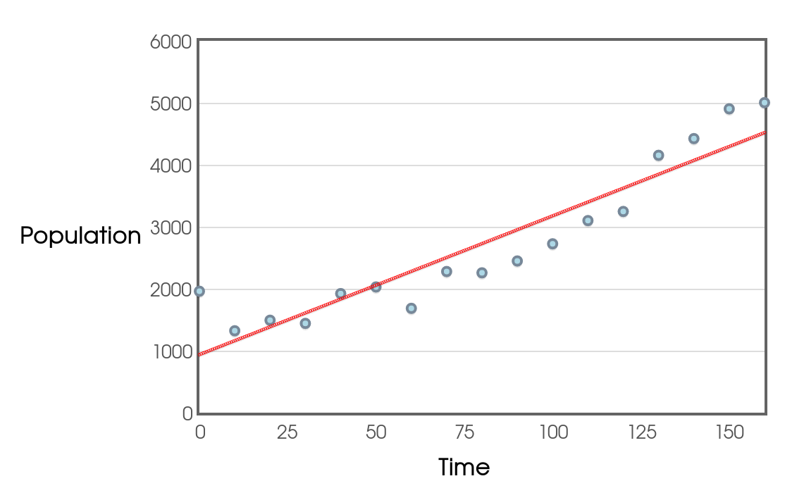
Perhaps this is a good model. We see a strong correlation and R-squared value. Let's look at the residual plot!
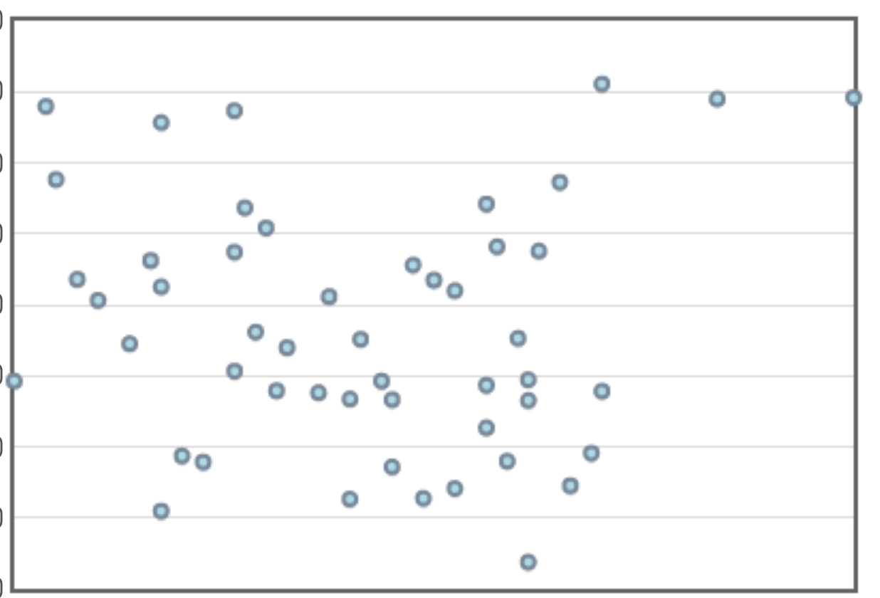
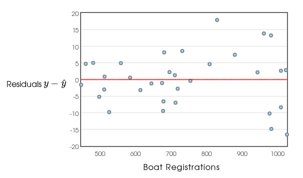
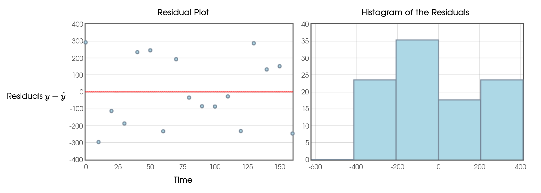
Example: Here's the residual plot for the linear model.
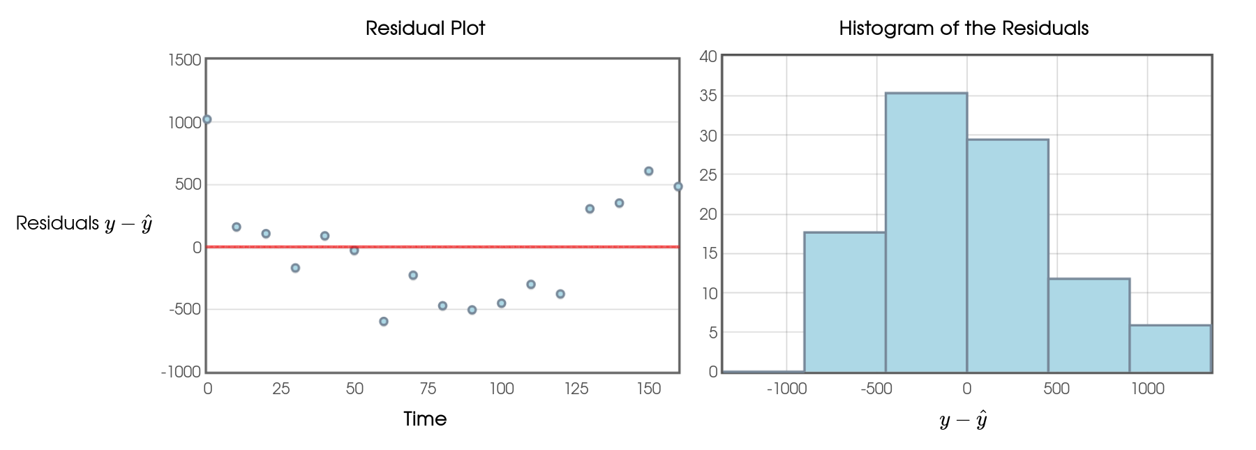
This residual plot amplifies the fact the the linear model consistently over predicts and under predicts over different intervals of time.
Also, the distribution of the residuals looks like it might have some skew.
From this, we suspect that the linear model might not be all that great. We're going to try a curved model.
Example
Here's the same data set with a curve of best fit.
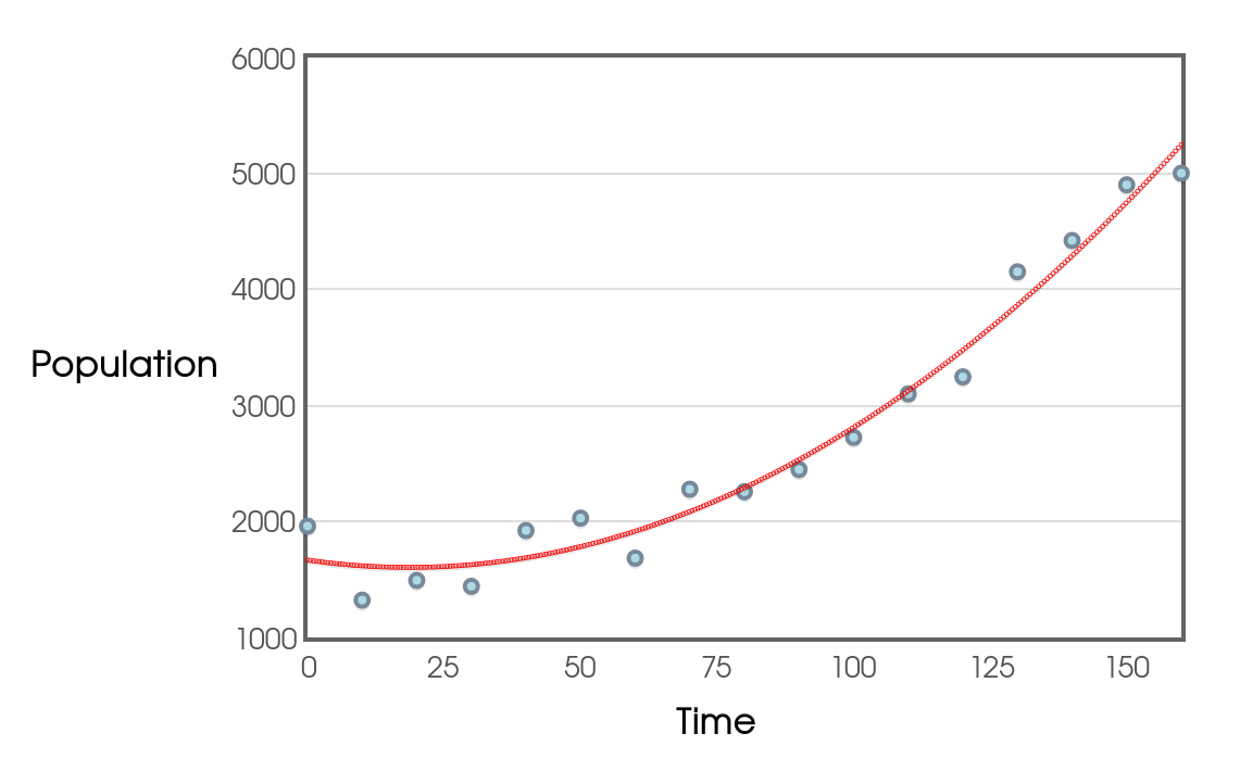

This model seems to fit the data better than the linear model. Also, the correlation (nonlinear!) and R-squared values show us that this model has more predictive power.
Looking at the residual plot...
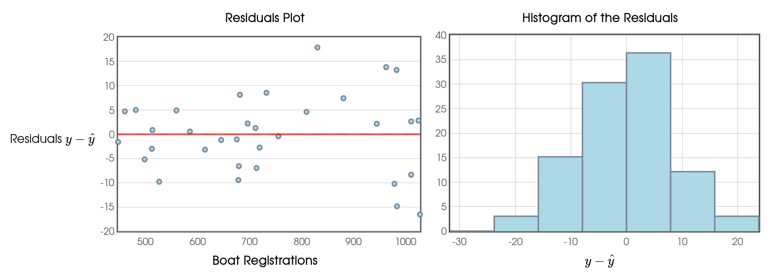
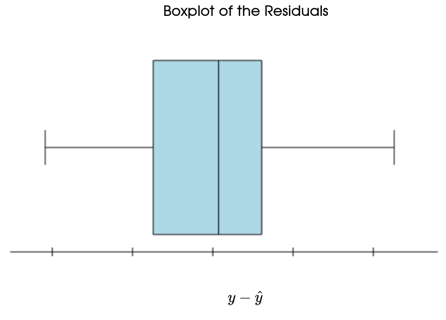
Example: Here's the residual plot for the curved model.
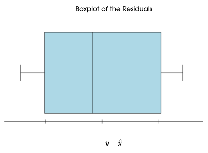
This residual plot has the three above-mentioned characteristics. This is all to say that this is a better model than the linear model.
Consideration #2: Influential Observations
An observation is influential for a statistical calculation if removing it would markedly change the result of the calculation.
The result of a statistical calculation may be of little practical use if it depends strongly on a few influential observations.
Points that are outliers in either the $x$ or the $y$ direction of a scatterplot are often influential for the correlation. Points that are outliers in the $x$ direction are often influential for the least-squares regression line.
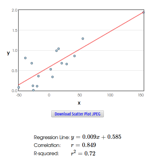
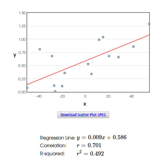
Example: Consider the following data set.
Consideration #3: The Tempting Danger of Extrapolation
Using a statistical model to make predictions outside of a data set is called extrapolation.
Example: Extrapolation Blunder
Below is the scatterplot of CDC data on the median height in centimeters of people aged $24$ months to $96$ months, that is from $2$ years to $8$ years of age.
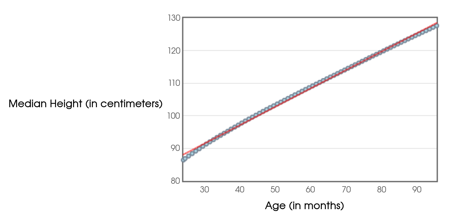
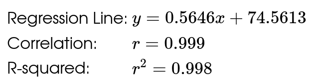
A linear model is questionable to begin with. That said, if we were to use the regression line to predict the median height for a person aged $25$ years ($300$ months), we would estimate a median height of $244$ centimeters. That's just over $8$ feet tall!
And last, but certainly not least...
Consideration #4 (and Savvy Citizen Fact)
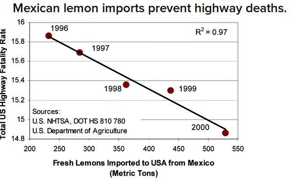
Correlation DOES NOT Imply Causation.
Just because two variables are strongly correlated doesn't mean that one causes the other.
Example: Consider the relationship between lemon imports from Mexico and traffic deaths in the United States.