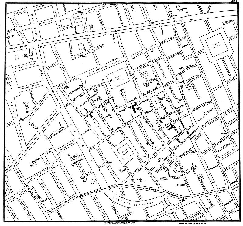
Let me tell you the story of a graph which changed the world.
Some people hate the very name of statistics, but I find them full of beauty and interest. Whenever they are not brutalised, but delicately handled by the higher methods, and are warily interpreted, their power of dealing with complicated phenomena is extraordinary.
-Sir Francis Galton
When we collect data, we are looking at a group of individuals.
The various attributes of these individuals are the variables.
Example: What were the individuals in the case of the "John Snow" graph?
What variable John Snow was interested in?
Some variables numerically measure some characteristic of an individual, such as height, weight, exam scores, and so on. These are called quantitative variables.
Other variables simply put individuals into categories, such as sex, school subject, color, and so on. These are called categorical variables.
Visualizing Categorical Variables: Pie Charts and Bar Charts
Pie charts visualize the fraction or percentage individuals which fall into distinct, non-overlapping, categories.
Pie charts emphasize every category's relation to the whole. A pie chart should include all the categories that make up a whole.
Bar charts show how percentages or counts vary across categories which may overlap.
Example: How do students pay for college? The Higher Education Research Institute’s Freshman Survey includes over 200,000 first-time full-time freshmen who entered college in 2009. The survey reports the following data on the sources students use to pay for college expenses. $$ \begin{array}{lr} \hline \mbox{Source for College Expenses} & \mbox{Students} \\\hline\hline \mbox{Family resources} & 78.2\%\\\hline \mbox{Student resources} & 62.8\%\\\hline \mbox{Aid—not to be repaid} & 70.0\%\\\hline \mbox{Aid—to be repaid} & 53.4\%\\\hline \mbox{Other} & 6.5\%\\\hline \end{array} $$
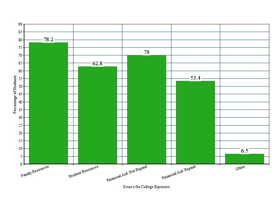
Question: Would the above data be appropriate to make into a pie chart?
Answer:

Example: Distribution of Electoral Power By State
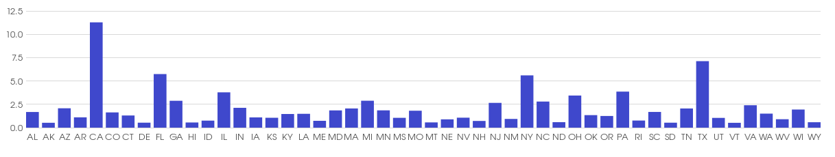
Question: Would the above data be appropriate to make into a pie chart?
Answer:

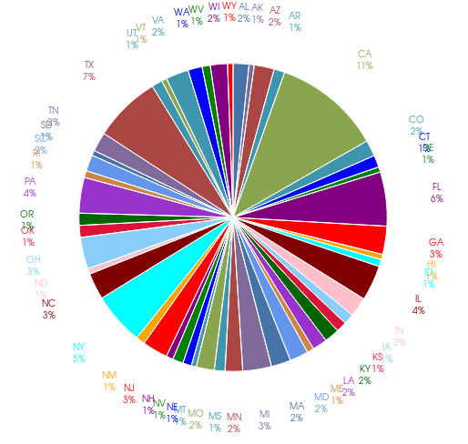
Example: Distribution of Electoral Power By State (in Pie Chart Form)
Visualizing Quantitative Variables: Histograms.
A histogram tells us how frequently a numerical value occurs for a given quantitative variable.
The frequency is either a count of how many times the value was observed, or a percentage of the total observations.
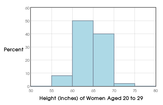
Example: The following data are the heights in inches of $100$ women aged $20$ to $29:$
65.1 65.2 65.2 60.8 61.1 66.3 67.2 63.8 61.6 62.0 65.8 62.6 63.1 61.3 60.3 58.7 62.3 60.5 65.6 66.0 66.6 67.2 63.6 66.1 61.7 65.2 61.7 59.1 67.1 61.7 67.3 65.1 63.7 66.7 64.2 63.8 63.3 63.0 59.8 65.6 64.9 71.6 65.1 63.0 64.6 63.9 57.8 63.6 66.9 65.8 67.9 66.4 59.9 55.9 67.6 65.2 63.2 61.5 69.2 61.1 66.4 67.3 62.4 64.1 62.8 58.8 63.1 61.4 67.9 66.3 62.4 62.7 62.9 67.5 70.9 67.3 62.9 66.6 63.5 61.5 63.8 63.8 66.4 66.4 63.0 66.1 67.1 61.7 63.7 67.0 62.7 67.7 64.4 66.7 64.3 61.1 59.5 61.0 66.5 64.9
We can make a histogram with our Course Website.
Describing distributions of Quantitative Variables:
Every distribution has a shape, center, and spread.
A symmetric distribution is roughly a mirror image about its center.
If a distribution has a long tail to the right, we say it's skewed to the right.
If a distribution has a long tail to the left, we say it's skewed to the left.
Observations which fall well outside of the overall pattern are called outliers.
Example: Consider height data we looked at earlier:
Example: The following data are the yearly salaries of Canadians in the year $1902:$

Example
Below is a histogram of the percent return on a randomly chosen collection of client portfolios for the S.P. Martini Wealth Management Company.
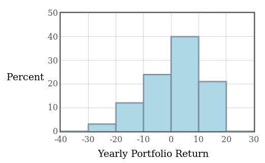
Question: About what percentage of portfolios saw a return between $-20\%$ and $-10\%?$
Question: About what percentage of portfolios actually made money (saw a return of more than $0\%$)?
Frequency Polygons
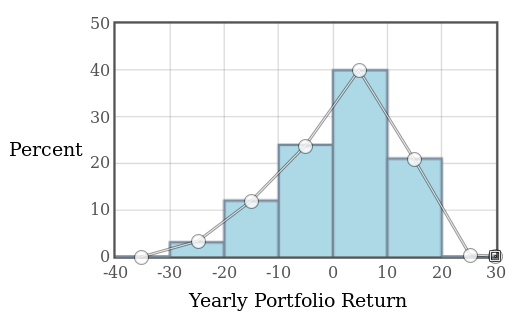
A frequency polygons is the line-graph version of a histogram.
They are also useful for understanding the shape of a distribution.
To make a frequency polygon, take the midpoint of each bar (or bin) as the horizontal, and plot it against the frequency (or relative frequency, or percentage) as the vertical.
Example: Below, the frequency polygon is overlaid on top of the histogram for the S.P. Martini Wealth Management Data.
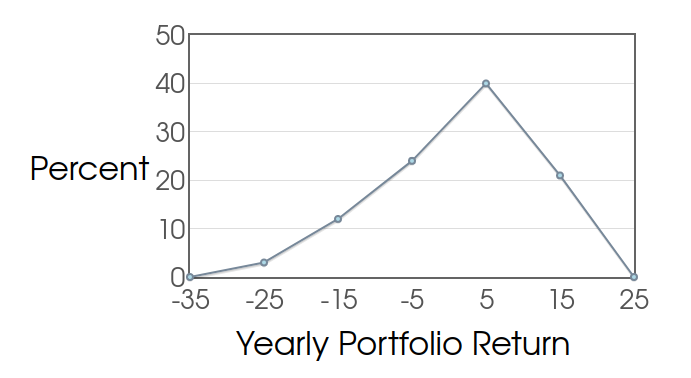
Example: Below is the frequency polygon for the S.P. Martini Wealth Management Data.
Stem Plots
Like a histogram, a stem plot tells us how frequently a numerical value occurs for a given quantitative variable.
A stem plot is a quick way to visualize data by hand.
We usually don't make stem plots for very large data sets.
Example: Make a stem plot for the following data which are the percentages of people aged 65 and older in 2009 for each state and the District of Columbia (Washington D.C.).
13.5 7.0 12.9 14.0 10.9 10.3 13.6 13.8 16.9 10.0 14.1 11.7 12.1 12.6 14.7 13.0 12.9 12.1 15.0 11.8 13.4 12.9 12.4 12.5 13.5 14.1 13.3 11.3 12.8 13.2 12.6 13.2 12.4 14.6 13.6 13.3 13.2 15.3 14.0 13.1 14.3 12.9 10.1 8.8 13.8 11.8 11.8 15.5 13.2 12.1 11.8
Arranging the data from smallest to largest to makes the process easier:
7 8.8 10.0 10.1 10.3 10.9 11.3 11.7 11.8 11.8 11.8 11.8 12.1 12.1 12.1 12.4 12.4 12.5 12.6 12.6 12.8 12.9 12.9 12.9 12.9 13.0 13.1 13.2 13.2 13.2 13.2 13.3 13.3 13.4 13.5 13.5 13.6 13.6 13.8 13.8 14.0 14.0 14.1 14.1 14.3 14.6 14.7 15.0 15.3 15.5 16.9
Misleading Graphs
As we've seen from our first example, a graph can be a powerful tool for understanding overall trends in data.
However, as with anything that is good and useful, it can be used for nefarious purposes.
We'll consider some graphical shenanigans to keep an eye out for whenever someone is trying to sell you something with a slick graphic.
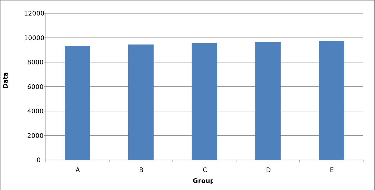
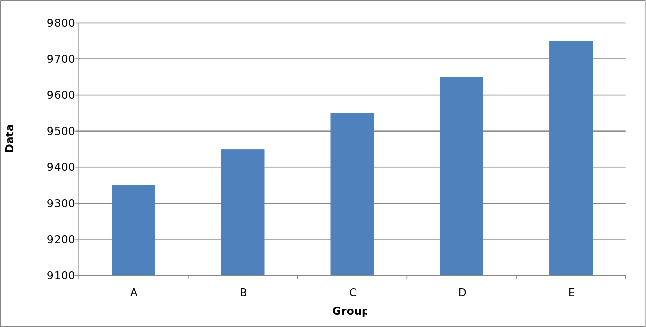
Misleading Graphical Technique #1: Changing the Vertical Scale
Consider the following graphic. The data is good, but there is something fishy about the way it is presented.
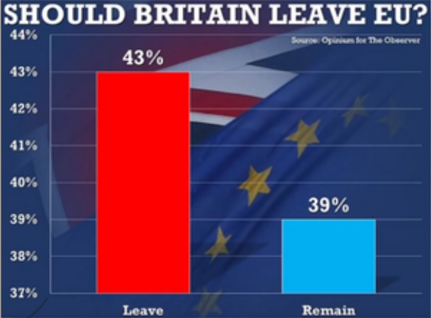
Misleading Graphical Technique #1: Changing the Vertical Scale
The following graph is a much better representation of the data:

Misleading Graphical Technique #1
Changing the vertical scale, particularly by truncating zero, can exaggerate differences or suggest false trends.
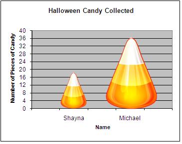
Misleading Graphical Technique #2: Using Scaled Images
The following is a graph that uses a scaled image to compare two quantities. The comparative heights are correct, but areas of the scaled images suggest that Michael's score is several times larger than Shayna's.
Misleading Graphical Technique #2: Using Scaled Images
The following graph is a more honest representation of the data.
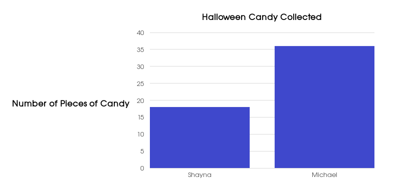
Misleading Graphical Technique #2: Using Scaled Images
Even though the comparative heights are correct, using the height of a scaled image to compare two quantities by their area suggests one is significantly larger than the other .

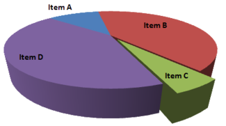
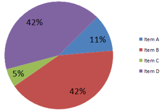
Misleading Graphical Technique #3: Unnecessary Perspective
Perspective and the illusion of depth might make a graph look slicker, but it has the very real potential to muddle the results. In particular, notice how Item D looks much larger than Item B in the left-hand graph, but in fact, as the right-hand graph shows, they are both the same size.